
Typography
Who would have guessed that two of my most challenging classes would be the ones I looked forward to the most?
Throughout Typography Two, I worked on creating spreads that combined a font and a brand of my choosing. The course emphasized understanding grids as tools for organization and expression, focusing on logic over style to achieve hierarchy and legibility. I was challenged to use the font as a graphic element and design a grid that balanced information and expression, demonstrating a clear sense of hierarchical composition.

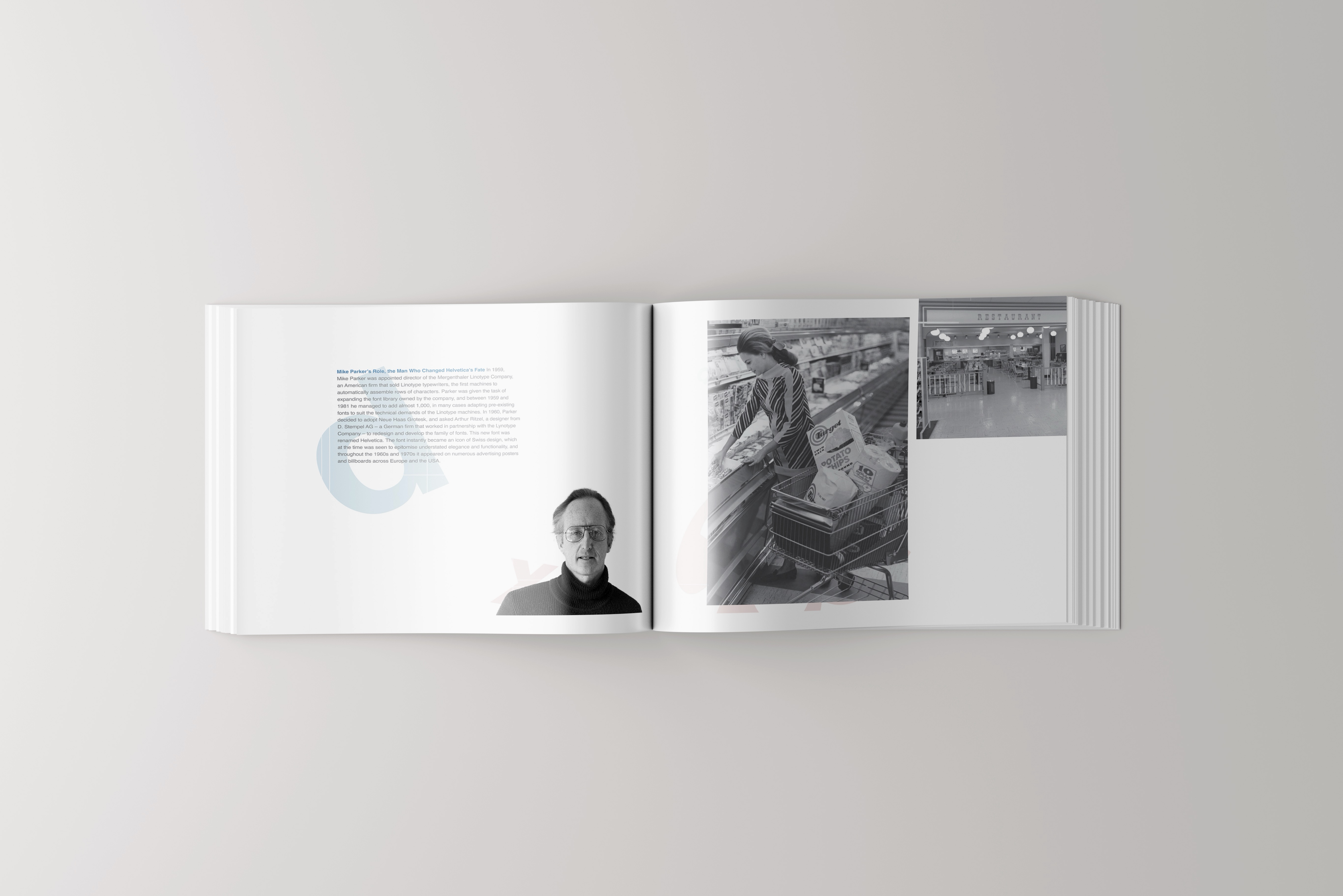
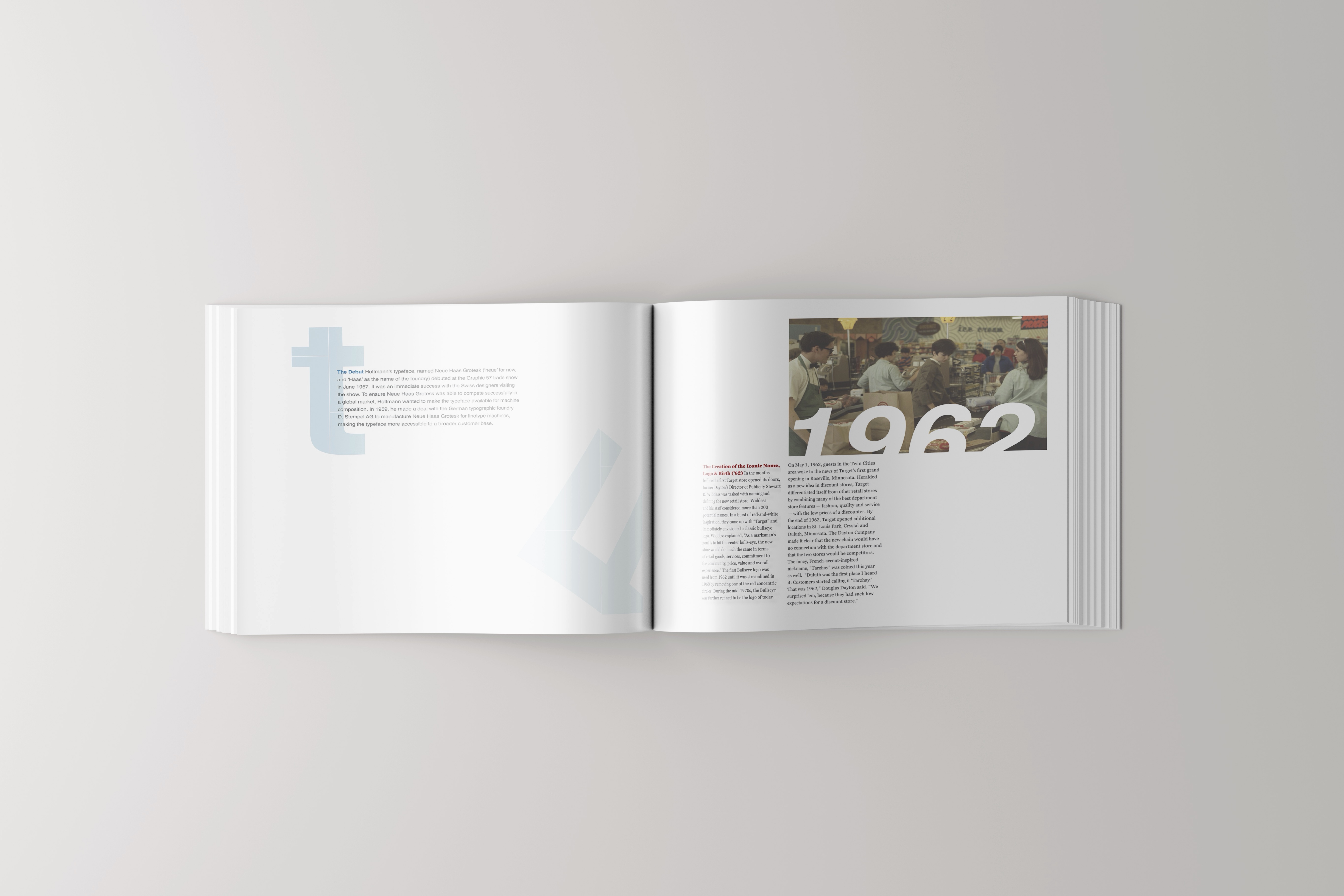
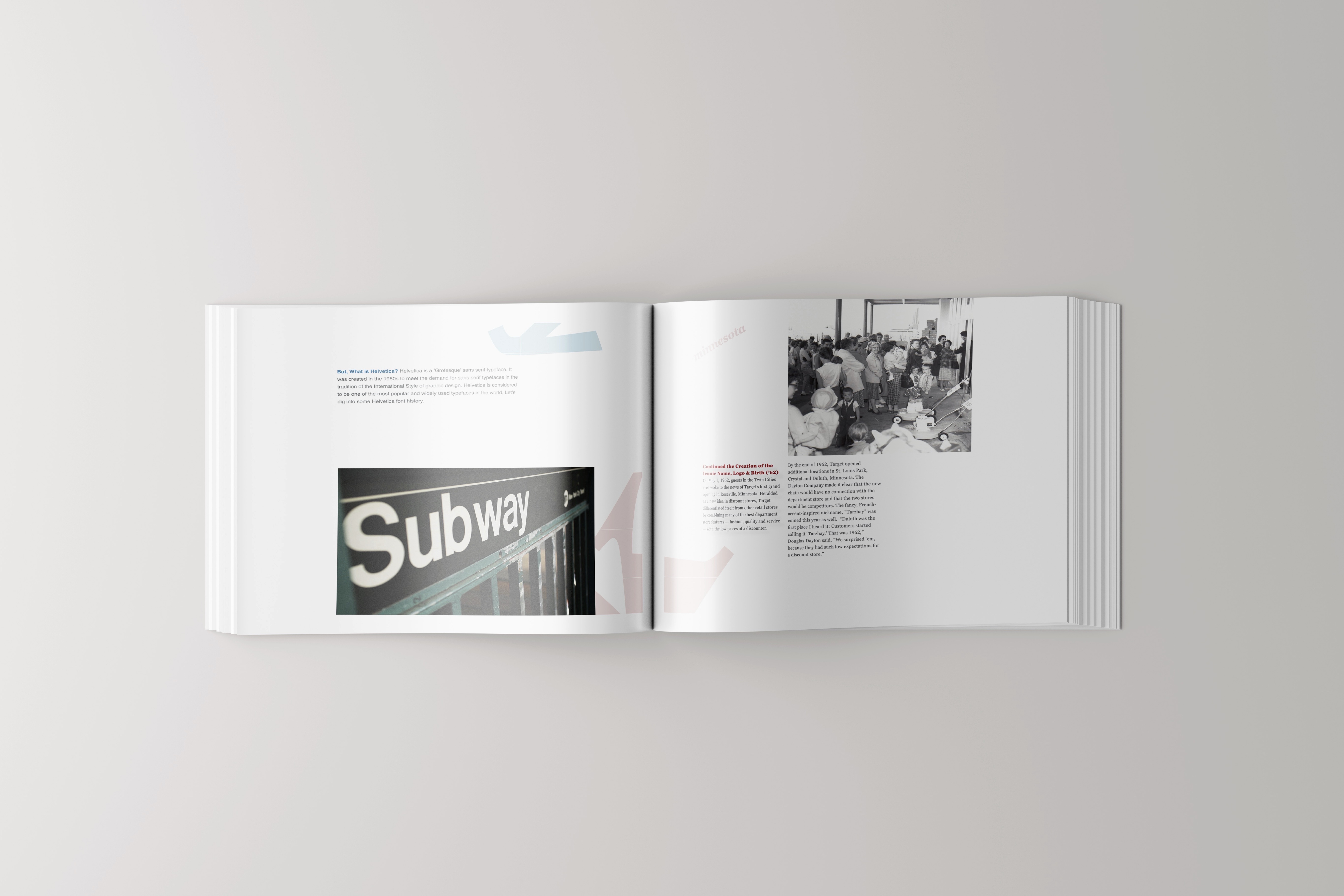
Although this was a process that required numerous iterations, my biggest challenge was finding the perfect balance between white space, cohesion, and the hierarchy of individual design elements.
Type Three presented a significant challenge...
This course presented a significant challenge: create a typeface of 26 letters.
Where would I even begin? Initial iterations were rough attempts, and I knew right away it wouldn’t satisfy my perfectionist tendencies. Many of my subsequent iterations felt similarly frustrating as I struggled to figure out how to approach typeface design. After four months of experimentation and refinement, I created a typeface that still fell short of my expectations. As a perfectionist, I knew it would have to suffice.
